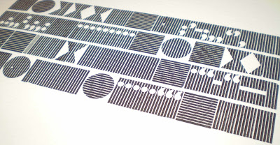
I started the day coining the phrase 'when in doubt get the shilling strokes out', and thats what I did. Printing onto offcuts of paper from a previous book project, a sort of reverse skyline, I composed a design using the different sizes of shilling strokes and printed in blue grey. Then I changed the composition and overprinted in black to give some depth. I am not sure yet what they will become. As the paper is pre-scored they are have the potential to fold and be free-standing so I intend to print on the reverse as well.
The next choice of type was this tray that Angie found in the store - Tom thinks it came from the Industrial Museum - with its gorgeous striped backgrounds. We don't know what its called, and couldn't even agree on the typeface, it looks like a Gill but on closer examination of the tail of the Q Phil said not. Any ideas?
Of course I decided to print all of the non-text pieces, which always seems like the right thing to do on a day where you have nothing to say. There was a bit of a bleed on some areas, which I think was down to over-inking. I gave the type a wipe over with some white spirit and re-inked without drying it off, leading to this much more varied, patchy print, which I really liked - happy accidents in letterpress!


No comments:
Post a Comment