One of the things I love about the letterpress enthusiasts that I have met is that they seem to have the capacity to get really excited about new developments, like people creating their own type, or experimenting with technique, using old technology in new ways, but also to light up at the sight of old forgotten bits of type that they stumble across. This happened this week when Lucy, one of our LEN members (or LEN-ners as we seem to be saying) brought in a fraction of a collection that she has discovered at a publishing house where she works.
So what was in this magic haul that made us go a bit giddy?
Having teased us a couple of weeks ago with a giant E, this week it was outdone by an even more massive M (hard to see scale here but approx. 40cm high).
And 2 boxes of printing blocks, including logos, letterheads, symbols, and some that appear to be from a catalogue - 2 diamond rings, 2 toast racks, and a cruet set! As far as we know the collection originated in the North East, and many of the companies identified have a Newcastle address. Some of them were not in great condition but we have found in the past that many blocks will print better than you would think, so we decided to set each box as one sheet and print them to see what sort of results were possible and to get a record of what was there.
Here is the first box of blocks locked up in the press, looking a bit fresher after a bit of a clean. This one included an order form for silk jumpers, a label for tea, a banner for the Order of the Sons of Temperance, company logos, a pool table, and a portrait of a bearded man.
Now unfortunately the wild stormy weather got the better of us and we had to pack up and leave in rather a hurry, so no photos yet of the printed results, we'll have to mark this one to be continued....
Here at the LEN blog we post updates, news, and tips from the Letterpress Studio at U.W.E (The University Of The West Of England). LEN sessions are held on Thursday evenings, for MA Multi-Disciplinary Printmaking Students and Staff: to to print together, show examples of work, swap tips, discuss our research, and support each other - developing practice both individually and collaboratively. LEN was founded by Angie Butler, PhD. student in Book Arts And Letterpress, at CFPR, UWE.
Saturday, 24 November 2012
LEN warm up
Sometimes I (Hazel) spend most of my MA Thursday before LEN working on the Vandercook, so it feels like a whole day of LEN, though without the others there to input and advise. I like to think I usually have an idea in my head of what I am going to print, but that is not always the case. On those days, if I am booked onto the press anyway, I tend to round up bits of materials, scraps and paper that I have been meaning to use, and any type that has caught my eye recently. This was one of those weeks.
I started the day coining the phrase 'when in doubt get the shilling strokes out', and thats what I did. Printing onto offcuts of paper from a previous book project, a sort of reverse skyline, I composed a design using the different sizes of shilling strokes and printed in blue grey. Then I changed the composition and overprinted in black to give some depth. I am not sure yet what they will become. As the paper is pre-scored they are have the potential to fold and be free-standing so I intend to print on the reverse as well.
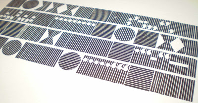
The next choice of type was this tray that Angie found in the store - Tom thinks it came from the Industrial Museum - with its gorgeous striped backgrounds. We don't know what its called, and couldn't even agree on the typeface, it looks like a Gill but on closer examination of the tail of the Q Phil said not. Any ideas?
Of course I decided to print all of the non-text pieces, which always seems like the right thing to do on a day where you have nothing to say. There was a bit of a bleed on some areas, which I think was down to over-inking. I gave the type a wipe over with some white spirit and re-inked without drying it off, leading to this much more varied, patchy print, which I really liked - happy accidents in letterpress!
Subscribe to:
Posts (Atom)


